Why We Love Graphics At C4ADS
If no one understands your research, did it really even happen? At C4ADS, we think hard about how to turn our research into concise analytical findings. Consistently, we find graphics to be one of the most effective ways of condensing research into a single, comprehensible format. Our work often requires the explanation of complex networks, relationships, and patterns that would be nearly impossible to make sense of without graphics. Good graphics pack in a lot of information, but they also drive you to ask questions and dig deeper.
Getting this right depends on choosing the right graphics. Representing the data in a dishonest or confusing way is worse than not using graphics at all. Here, I wish to highlight a few examples in which we have structured complex and large data sets to make them intuitive and informative. This work would not have been possible without the R Suite of software and our wonderful Senior Analyst, Patrick Baine.
Flying Under the Radar: Wildlife Trafficking in the Air Transport Sector #
How do you map the air transit routes used for wildlife trafficking? This is not an easy task, especially given the lack of open source data on the issue. For the ROUTES project, we needed to reconcile several different databases of seizures in the air transport sector of various wildlife products to help industry, government, and civil society better understand the flow of these products.
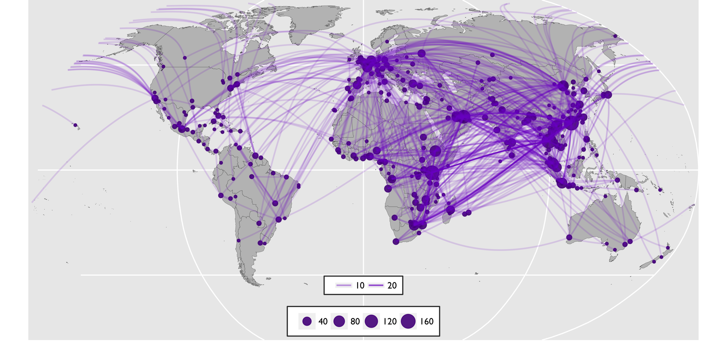
This map is helpful because it gives you a few pieces of basic insight right when you first look at it. It then prompts you to ask questions. There appears to be more activity in Europe, Africa, and Asia; why? Why is there so little in North and South America? What about Australia? I don’t usually think of Western Europe as a trafficking hotspot, so what is going on there? If you were to look at the spreadsheets of data that went into this graphic, I doubt that many people would come away with the same level of insight as they would by looking at the graphic. Graphics like this help you see the bigger picture and then encourage you to ask important research questions.
World Customs Organization: Cultural Heritage Trafficking in 2016 #
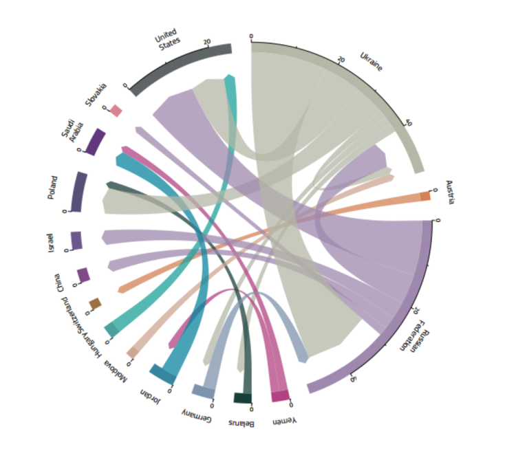
For this project, C4ADS analyzed World Customs Organization data to determine patterns in the trafficking of cultural heritage objects, such as antiquities, art, or other significant objects. This graphic shows the flow of cultural heritage trafficking in 2016. The chart visualizes the flow of goods from the country in which they originated to the destination country, as indicated by the arrow. The number of goods per country can be seen along the edge of the circle.
This is another graphic that 1) is pleasing to the eye, 2) does a great job of conveying movement (before you even have context, you know something is moving from one place to another), and 3) raises questions. One question that is raised by this graphic is what happened to the cultural heritage flowing out of Syria given the context of events there in 2016? Given the news coverage of the issue, I would have expected to see that show up here, and yet… Questions like this require more digging to answer, and can even become the base of full-fledged C4ADS projects.
World Customs Organization: Psychotropic Substance Seizure in 2016 #
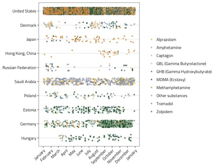
For the same WCO project, C4ADS received a different dataset related to seizures of narcotics. While flows were interesting, other patterns related to time of seizure told an equally compelling story. This jitter plot represents seizures of psychotropic substances in 2016 by country. From the chaos of dots, patterns emerge. Again, this graphic gives insight, but also points to important questions and next steps for further research. What caused the increase of seizures in the second half of the year in Germany? Why did Estonia have a drop in seizures at the end of the year? Was there a reason that Hungary started reporting seizures in March? What about the trends within the types of psychotropic substances being seized? Most strikingly, what caused the glaring disparity between the frequency of seizures in the United States compared to the rest of the world? By looking at this graphic, you can both gain knowledge and understand that there are underlying trends in drug trafficking that require further study.
These are only three examples from one of the multiple platforms we use to develop graphics, but I think they do a great job of demonstrating what great graphics can do, and how they can add to stellar research. The complexity of the world in which we live and the data it produces will only continue to grow. We want to continue to explore new and innovative approaches to open source data and analysis, and eye-catching and insightful graphics are going to be a key component of our approach.